As you can see from the video above we have gained inspiration from films such as The Shining and Sorority Row as we felt the story lines that were used across both were highly effective in reaching the audience. Also, we have combined three separate ideas together in order to create a final idea. We looked at films such as dirty pretty things but found that the storyline wasn't as effective, therefore we challenged the forms conventions used within this film. We developed the idea from sorority row into our own unique idea that would be able to meet the needs of the horror audience.
Friday, 18 March 2011
How did you use new media technologies in the construction and research, planning and evaluation stages?
A wide range of new media technologies were included in the development, construction and production of my teaser trailer package. These media technologies have allowed my teaser trailer package to be proffessional and of a high standard.
The sources that I have used within the development of my project include YouTube, IMBD and Flickr. These sources have allowed me to gain the relevant influence and inspirations needed to construct the trailer, web page and poster. I feel that without these sources of inspiration it would have been difficult to decide on specific aspects to include in our storyline and also the types of shots that we could implement within the teaser trailer. Also, I have been able to research established horror and thriller movies to gain inspiration for my web page and poster as I will need to ensure that they are able to graspt the audiences attention fully, and ofcourse in the right way.
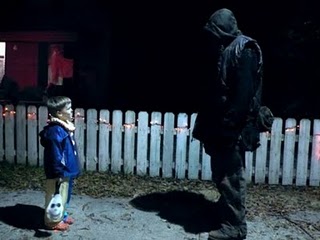
The main source that I used for the construction of my teaser trailer package was Imovie as it allowed me to edit footage by changing saturation as well as shorten and legngthen shots. It also allowed us to add text, sound and include still shots to create a teaser trailer with the element of tension and suspense. Without this source, I wouldnt have been able to create a teaser trailer that was effective in attracting an audience and portraying and conveying the horror/thriller genre. Macromedia MX and Photoshop allowed my group and I to create a web page and poster. The main features of Macromedia that my group found useful was the ability to change the size, type and colour of font as well as being able to upload images onto the webpage that had been previously constructed on Photoshop. Photoshop has allowed my group and I to take screen grabs from our finished trailer on Imovie and develop them into a whole image conveying a breif outline of the film. The screen grab below is a still that we used within the trailer in order to lengthen the shot and create the suspense of our main character being watched by Josh whilst not being aware.

As you can see this shot is highly effective due to the mise-en-scene and angle of the shot. You can see that the girl is suffering from a negative emotion and looks stressed. Little does she know, she is being watched by a dark figure through the glass door. This therefore creates tension as the audience will feel empathetic for the character because they are able to see what she cant. This therefore relates to the 'Bomb Theory' as it meets 4 out of the 5 components. The four components that it meets is empathy with character, knowing more than the character, placing ideas in mind and also creating a sense of false plateau.
Thursday, 17 March 2011
What have you learned from your audience feedback?
Audience feedback has played an important role in understanding the strengths and weaknesses that myself and my group posses. By gaining audience feedback we have been to adapt the criticism into constructive targets that we can develop for future projects. With reference to the answers of my questionnaire shown previously in the blog, you can see that there have been clear strengths such as the establishment of the horror/thriller and also some clear improvements such as making the storyline easier to understand by the audience.
After completing the first draft of my group's trailer we decided to embed the video on YouTube as well as locating it upon Facebook, a social networking site. We done this in order to gain feedback from our potential audience on the positives and negatives surrounding the trailer. Some of the comments that were given were positive however some stated some minor changes that could have been made in order to improve the trailer. This constructive criticism has allowed my group and I to understand our weaknesses, allowing us to be able to build on them and turn them into strengths. this will therefore allow future projects to be of a higher standard attracting our target audience correctly.
PRINT SCREEN OF FACEBOOK WITH COMMENTS
PRINT SCREEN OF FACEBOOK WITH COMMENTS

As well as completing the above forms of audience feedback, I have held interviews with some of my potential target audience in order to find out their honest opinions regarding the trailer and its ancillary texts. Below are 2 videos of audience feedback where I have asked clear questions to the interviewees in order to prompt honest, specific answers.
Questionnaire and Audience Feedback
After presenting my teaser trailer package to a sample of friends and family I handed out a questionnaire in order to find out their honest opinions regarding the teaser trailer, poster and website. The questionnaire consisted of the questions and structure shown in the print screen below:

As you can see, the questionnaire consists of questions that are relevant to the teaser trailer package and the possible improvements that could be made. After handing out the questionnaire and gaining feedback from my interviewees I have been able to conclude the following bits of information regarding our teaser trailer package:
· The combination our our main product and ancillary texts is very effective as the colour scheme is consistent and is carried through the website, poster and trailer. This therefore means that our audience will be able to make clear links between the three. Also, from a first glance at the poster and web page, interviewees feel that the levels of text and colours used are not overpowering and are asthetically pleasing to the viewers eyes.
· 17/20 people stated that the horror/thriller genre is clearly established through the combination of our main product and ancillary texts. The remainding three people stated the genre was slightly noticeable. Therefore as a group we can take this criticism and make some amendments to ensure our audience can make a clear link.
· 20/20 interviewees stated that they felt the storyline and the title of the film corresponded and made a clear link, however 7/20 people stated that they was able to understand the storyline. This therefore is positive as a teaser trailer is meant to confuse viewers making them want to know more about the film as they have only been given small amounts of information regarding the film.
· Overall, the feedback was positive and reassured my group and I that we have achieved the aims and objectives that we set to achieve. Regarding additional comments, interviewees stated that they found the teaser trailer had a professional feel about it and the text located in the trailer related to the footage they were being shown.
How effective is the combination of your main product and ancillary texts?
I feel that my main product (trailer) and my ancillary texts (poster and web page) have a clear, strong link that is consistently carried through allowing the combination between the three products to be highly effective. For instance the use of the still images taken from the teaser trailer and located on the poster and web page as the main image identifies a clear link between all three products. Secondly the consistent colour scheme that has been used, for example red and white text with a black background, allows the audience to make a quick link between the three products without having to read large amounts of text.
In the video below, I am stating the other factors included in my main product and ancillary texts that allow a solid link to be created.
Tuesday, 15 March 2011
Webpage Upload
After condusting the needed research regarding the codes and conventions of horror/thriller movie web pages, my group and I have made the web page below:

I am very pleased with the final outcome of our web page as it makes a strong bond with my poster as well as the trailer. The images used on the webpage represent the two main charatcers in the film and the emotions that they are going through. For instance Josh is placed within a circle, symbolic of the trap he is placed within during the extract. Myself (Kerry) however is placed on top merged into the background showing a deep, aggressive emotion representing the pain that she is going through. The combination between my main product and this ancillary text is strong and there is a clear link and bond between the two, therefore I feel that this web page is very effective. The inspirations I have gained from my web page research are clear in the poster. For instance, the links to social networking sites as well as including hyperlinks which are relevant to the genre. However, I have adapted Joel Sklars theory of placing the navigation bar across the top of the webpage by locatin them at the bottom as I feel that this is more effective.
Poster Upload
Our completed poster is located in the screen grab below:


As you can see from looking at both of my ancillary texts, there has been a strong link made. The image that has been included on my poster is the same image positioned on the web page. This is also relevant to the title of the film, as they are the exact same image that has been used twice. The main inspiration used for my poster has come from looking at the poster for the film 'BUG', referenced in my poster inspirations, as it uses the technique of merging images together and blurring them to make them work together as if they are one photo. I feel that is effective as it gives a sense of the danger that is ahead. The colours used within the poster are also symbolic of this. For instance josh is placed in quite suttle, realistic colours whereas myself (Kerry) has a more deep red glow. Therefore, the red represents the evil that is going to be seen from the character during the extract.
We decided to place a quote from the Guardian as well as the characters names at the top of the poster as we found most horror posters tend to locate their names in this position and also reference established media's such as The Times, Guardian or other institutions. Also, the text located at the bottom of the poster is essential for the layout of the poster as all posters include information regarding the production and distribution of the film.
Teaser Trailer Upload
Below is the finished teaser trailer product produced by my group and I. As you can see footage has been edited and sound has been placed on top of the footage in order to create a scary atomosphere. My group and I are all pleased with the outcome of our trailer.
Monday, 14 March 2011
Website Inspirations
A website that has gained a large amount of attention from myself and my group is the Sorority Row Website (open link to see entire website).

This web page was inspirational for the following reasons:
- Colours - red and black symbloic of danger
- Collage of images - gives viewer an insight into the storyline and what is going to occour throughout the film
- Hyperlinks - the hyperlinks included are relevant to consumer needs and directs viewers to view the needed information regarding the film
- Text - the text is easy to read, and all text is relevant, title is shown clearly and there are links to social networking sites, influncing the audience to become part of the promotion and film
Another website that I found highly effective although my group did not agree is the Batman Returns (Why So Serious?) website (open link to see entire website).

This webpage was influential for the reasons below:
- ARG - the website relates and follows the alternate reality game that Batman was aiming to achieve
- Hints and Clues - images provide the audience with little knowledge of the film, however provides them with enough to understand the storyline
- Colours - all colours work together and the collage is effective due to the images corresponding to the film
After carrying out secondary research on websites and finding out what makes them effective to the audience, i have been able to conlude the following decisions regarding my own webpage:
- To use colours that are symbolic of the storyline (ie dark colours for an eery effect aswell as red to show danger and death)
- To include small amounts of text to ensure that the web page is not too text heavy and relates to the web page being a teaser for the audience
- Create links to social networking sites in order to provide links with consumers and the film, therefore making them feel a part of the film as well as ensuring the right target audience is met.
- Ensure all hyperlinks are relevant and provide the needed information for the audience. For instance links to gallery, characters and about the film will be effective however links to games and other uncessecary websites may not be as effective
Tuesday, 8 March 2011
Poster Inspirations
Once we had completed the trailer, it was time to explore the creation of our poster. This made us think about specific text and aspects that needed to be included on the poster. These are as stated below:
- Film name
- Slogan in relation to the film
- Character names
- A main image
- Quotes from trusted sources IE The Guardian
It is crucial that my group and I carried out research regarding other horror posters as it would allow us to gain the needed knowledge and inspiration to ensure our own poster is going to be effective. This research will allow me to understand what is common across most horror posters to ensure that the codes and conventions of horror posters is achieved. Before creating the poster for my group teaser trailer package, I thought it would be valuable to research into the different types of posters created for previous horror trailer packages. This would therefore allow my group to understand the different styles and techniques that would be adaptable to our teaser trailer.

Sorority Row is a poster that attracted large amounts of interest from myself and my group. The main inspiration I gained from looking at this poster was the fact that it uses one main image as well as background images that correlate and interlink with each other whilst also making a strong link to the film. Although the images of the five girls isn't striking out as a scary image, the fact that is placed on top of a burning house creates a scary effect, allowing the viewers to understand that something chilling is going to occur during the film. The colour red is symbolic of blood, death and danger which therefore gives the audience an idea of the content of the film. Overall, I believe that this poster is highly effective as the genre of the film is fed to the viewers clearly and effectively, allowing there to be no confusion regarding the film whilst also ensuring the right target audience is reached.

Another inspirational poster that gained large amounts of interest from my group and I was 'The Strangers'. As we all found the trailer effective in the way that it uses a variety of different techniques to convey a disturbing and chilling effect to the viewers, we thought it would be in our own interest to explore the techniques used in their poster.The image used on the poster portrays and conveys a sense of entrapment and fear to the viewers as there is a couple that have been placed in a difficult situation by three masked protagonists. There is a strong link between the trailer and poster which influences the audience to want to watch the entire movie.
The slogan located at the top of the poster reinforces the link between the storyline of the film as the victims are disrupted at 4am and placed under the control of the masked people. This allows the entire concept of the film to be grasped with one look at the poster. Although there is limited use of text on the poster, the poster is still effective. It has become clear that most posters aim for a simplistic poster when regarding text and highlight the horror with the use of an effective image. The dim and dark lighting used in this poster allows the genre of the film to be portrayed within a short period of time, therefore allowing the viewers to decide whether this film is going to be one in their interest.


The main inspiration that this poster has given me is the fact that it uses two images layered on top of each other with a multiplying effect on photoshop. This therefore allows the under images to be seen through the top image. I find this technique highly effective as it creates suspense and leads to the viewer to wanting to know more about the film and why there are two images blurred together. I aim to use this technique within my own poster as it is highly effective and grasped my attention from the first glance. Also, the use of a black background allows a dark and negative emotion to be created. The grey scale images also create a sinister, mysterious and oppressive image to the viewers. Again, in this poster there is a limited amount of text only stating the title, characters name, a quote and production information. This therefore corrlates with the simplistic layour earlier mentioned.
After conducting all research regarding posters, it has become clear that all posters aim for a simplistic layout with a strong and bold image located in the centre of the poster with minimal amounts of text located across the top and bottom of the poster. Therefore, I am going to ensure my group poster uses the same layout, therefore allowing our poster to be as effective as possible.
Tuesday, 15 February 2011
Lighting
The images I have selected below show how lighting can be used to transform a shot and create a high level of suspense and effect.


Cinematography
The images below show the effective use of cinematography in The Shining and Dirty Pretty Things that have inspired myself and my group to use symmetry and the use of props to create effect in our trailer.


Looking at this screen grab from the film I feel highly inspired. This is due to the way that the two characters are shown in a juxtaposed position placed in the same location and in the same pose. This can be metaphorical for the similarities in their lifestyles as they are both illegal immigrants. Also, the fact they are both wearing the colour red shows that there is bond between the two characters as well as being symbolic of the danger ahead. The director has used yellow lighting as it gives a warm and comfortable effect, suggesting that when the characters are located in the hotel they feel safe and secure, away from the danger and harm going on around them. The cinematography used here is effective as the lighting and camera choices have been thought about carefully. (Dirty Pretty Things)
Editing Diary
To edit our footage and create the final teaser trailer, my group used IMovie as the main software. I have previously used this software package in year 12 where I was placed into a group of 3 and we had to make a short movie which included editing aspects such as shortening clips, adding sound and including transitions.
When it come to editing our footage, we dealt with the task as a group. As we was working on the IMovie software package that no one was fully experienced in, we decided that if we deal with the task as a group rather than delegating smaller tasks across the group then we would be able to create a more effective and successful final product.
It took roughly 2 weeks to complete the editing fully as there was many aspects that needed to be carried out. Rather than posting a daily editing diary I have kept a paper diary of the tasks that got completed on each day. This paper diary has been typed up below:
Editing Diary Day 1:
On the first day of editing we had to transfer the footage to the IMovie software via a fire wire where all footage was uploaded and shown to us on the screen. As IMovie uploads footage in real time, this task took a whole lesson as we had a large amount of footage due to shots being taken 3 or 4 times. Therefore, we wasn't able to begin editing today due to the long wait for footage to upload.
Editing Diary Days 2 and 3:On the second day of uploading, we looked through all of the footage and decided what bits of footage was relevant and the bits that we wasn't going to use. This took a long time as there was debates over the bits of footage that we felt would and wouldn't work. Once we had decided on the footage we wanted to use, we then placed the footage in order according to our storyboard. Although we had a clear structure of what footage we wanted and needed to use, we felt that some aspects didn't work so we rearranged some clips and moved away from the structure of our storyboard.
Editing Diary Day 4:
Now that we have the structure of the footage in order and complete, we began to add transitions and shortened clips to ensure our trailer did not exceed 1min30secs. This took a 2 hour lesson to complete as we wanted to make sure our trailer looked aesthetically pleasing to the viewer and that each clip flowed into the next one properly and smoothly and that there was no jumping of the clips.
Editing Diary Day 5:
To add effect to our trailer, we decided to place black clips in areas of the trailer where text could be inputted to create suspense for the viewer watching it. We used phrases that would relate to our trailer package, however we aimed not to give away too much information and aimed to confuse the viewers as it was only a teaser trailer, not our full trailer.
Editing Diary Day 6:
When it came to adding music, we had a major problem arise. We were informed that it was within the rules of the exam board that any music added to the trailer had to be copyright free. Therefore we had to research and look for sounds that weren't attached to any copyright laws. We looked at websites such as http://www.freeplaymusic.com/ and http://www.music4yourvids.co.uk/ to find the needed sounds. Eventually, we found a clip of a heartbeat to play throughout the whole trailer and added this sound clip to the IMovie software. However, we also found another clip of music that we found eery and scary that we placed over the heartbeat sound. Both of these sounds interlinked and work fantastically well together and added extra effect to our final product.
Editing Diary Day 7:
Finally, we added credits to the trailer such as the name of the film and the actors and actresses acting in the film. Once we had added these credits, we had completed our trailer.
Friday, 11 February 2011
Poster Design Diary
The task of creating the poster for our trailer package was delegated to the other two members of my group, i was largely involved in the creation of the poster due to one of the members not attending the lesson. Therefore I was able to ensure that there was going to be strong and clear links between the poster and web page. Myself and the other member of my group was aiming to create a poster diary where we stated the aspects of construction, however working in a group we managed to create the poster in one day. Therefore the steps that we took in order to create the poster are bullet pointed below:
- We took the image used on the web page that was created on photoshop via the merge and blur tools
- We placed this image on a plain white background and used a background fill (black) to create the plain dark background
- We then looked at different DVD covers for inspiration on the text to include at the bottom of the poster
- We then placed text onto the bottom of the poster and created an R Rated 18 symbol to locate in the bottom right hand corner of the poster
- We then used the title located on the web page to locate at the on the poster as well as writing our names at the top of the poster
- We then added a quote from 'The Guardian' newspaper saying our film was a 4 star film and was a good film to go and watch
Once we had done all of the above we gained feedback from the rest of our class on what we could improve and refine to make the poster look better. We refined sections of the poster such as the location of character names and the text at the bottom of the page which gave us the finished poster that we were both very pleased with.
Web Design Diary
When deciding who should be delegated the task of creating the web page for our teaser trailer package, I stepped forward and took on the task due to having gained skillsfrom previous tasks completed on the Macromedia Dreamweaver MX software. Therefore the construction of the website was in my hands. This meant that I had to ensure the web page coveys and portrays a professional image as well as correlating with the poster which was being created by the other two members of my group. Another important factor that I had to ensure was that the web page and poster both linked back to the trailer to ensure that viewers are able to notice a clear link across the three aspects.
Before I began to create the web page, i wanted to familiarize myself with the software so i spent a 2 hour lesson experimenting with the different aspects of the software package so I was able to find the most suitable techniques for my final web page.
Although it took only 2 lessons to create the full website, i kept a diary of what I accomplished on each day so that I was able to refer back and show the other members of my group what I had achieved. The diary is shown below:
Web Page Design Day 1:
On day 1 of the web design i focused on creating a layout and structure so that I was able to then insert the main image into the centre of the page to finish it. Therefore I created a black background to work as the under layer for the web page of which the main information and images were going to be placed on top of. I also added text at the bottom of the page to create a professional look. Also, on this day i created the navigation bar with interactive rollover buttons. In order to create these I had to go onto photoshop and design the same word twice in different colours so that when scrolled over by the user, the colour changes.
Web Page Design Day 2:
On day 2 of web design I inserted an image onto the middle of the web page and then added additional symbols and text at the bottom of the page to define and refine the page. As well as going this, I created a title for the film on photoshop with another member of my group that we then placed on the web page. This title is also going to be inserted on the poster and at the end of the teaser trailer.
Filming Diary
Before my group and I went out to film the footage for our trailer we conducted some practice runs with the camera where all members of the group learned how to use the camera properly to ensure that the footage filmed was effective and fully useful. Members of the group learned how to zoom in and out and hold the camera steady. Below is a short clip of the practice footage that we shot.
CLIP OF PRACTICE FOOTAGE.
When my group and I was producing the footage to use in our teaser trailer I kept a paper diary of the locations we visited and the shots that we took as I found it a good way of being able to look back over what we have accomplished. I have typed this diary up below:
Filming Day 1:
On the first day of filming we chose to shoot footage in the Barbican Centre (refer to location spotting images) as it was going to be one of the main sources of filming for the trailer. Whilst here we shot the clips of me and Beckie feeling as if we were being followed. Also, we shot the bathroom scene where I come face to face with Josh and become increasingly worried.
On day 2 of filming my group and I went to Beckie's house (member of group) to film some footage of the two main characters in a front room of her house due to the lighting being natural and yellow, allowing a warm atomosphere to be created. On this day we also took shots of Josh on the floor after being killed by me.
Filming Day 3:
On day 2 visited Holly Lodge (an estate local to school) where we filmed shots of myself walking up a hill being followed by Josh. We chose to shoot it here last minute, however it worked to our advantage due to the roads being scarily quiet and the houses being very large and expensive. Therefore it seemed as if I was positioned in a location that was unfamiliar and which was not stereotypical for my character to be placed in.
Filming Day 4:
We visited a local park where we could film some shots of josh close up and far away to include within the trailer. We also visisted a local graveyard so that we could get a shot of a gravestone.
Filming Day 5:
On the last day of filming we went back to Beckie's house so that we could re-shoot some shots of josh being killed because they were too shaky before hand.
Sound Inspiration
When looking for sound that could be used in correlation with my teaser trailer I thought that the quiet sound of a music box in the background would create an eery yet effective atmosphere. However another member of my group thought that a heartbeat would be more effective. Therefore we decided that we would not use the jewellery box sound and stick to the heartbeat as it was more suttle and create a more effective sound. Then we further decided that we would like to have a theme tune on top of the heartbeat and have each beat mix in with the background music.
Once we had decided to look for a background theme song, we needed to find a website that copyright free music. We found a website called www.freeplaymusic.com where we could search through hundreds of songs until we found the right one. As we was using freeplay music, there was no copyright laws affecting us so we was able to use the music without consent from the producers.
Below is a video of the ballerina style music that we was going use as well as the heartbeat sound we have included in the trailer.
Image Sources and Inspirations

One of my main image sources was http://www.google.com/ as you are able find images in relation to any theme or genre needed. Therefore I was able to use google in order to find still images that were included in my inspirational films. I was able to use google in order to research the lighting and cinematography aspects of filming that played a major part in the research for the techniques I needed to use when filming my teaser trailer. Also, google allowed myself and my group to view posters that were part of the teaser trailer package created by directors to promote films. Therefore I was able to gain influential ideas for my own poster and web page.

Another important source that allowed my group to conduct relevant research was IMDb (International Movie Database). From this website I was able to find information such as the cast, director, producer and release dates for the films that I used in my inspiration stages.
Joel Sklar - Web Design Theory

The web design theory constructed by Joel Sklar allows web design users to create a web page which is aesthetically pleasing to the viewers eye. Due to having created a web page in year 12, with the genre of a children's charity, I am aware of this theory which therefore means that I am able to adapt the theory and take on board the relevant areas so that when constructing and building my web page I am able to place specific texts and images in areas of which the viewer will be able to understand.
The image above shows what Joel Sklar decided. He stated that when a user enters a web page their eyes will follow a specific routine. They will firstly look at the middle of the page, therefore images and text heavy objects should be placed here. Secondly, they will look across the top for a navigation bar and/or title of the web page. The last 2 steps of the cycle are the side areas of the page where there should be additional links and moving images.
After researching this theory and learning to understand the basic principles, I have decided that I am going to follow this construction method when creating my web page. However I am not going to include additional links or moving images at the side of the web page and i am instead going to place some links and text at the bottom of the page.
YouTube
Youtube was a main source of researching teaser trailers and watching movies in relation to the horror and thriller genres. I used this website in order to gain inspiration and conduct the needed research. Once I have completed my trailer I am going to upload it onto Youtube so that I can gain feedback and constructive criticism on areas which could have been improved. This will therefore allow me to improve areas that need to be refined on future projects that I take part in.
Adobe Photoshop

We are going to be using Photoshop when creating the Poster for our teaser trailer package and also to create the rollover images for the web page. As no members of my group have previous knowledge of Photoshop it is going to take a while to get used to the software and understand the techniques it offers us.
As the web page was created before the poster, I was able to use the software for a while longer than the other members of my group which meant that I was able to pass on knowledge on the techniques that I learnt.
Photoshop will allow my group to make major changes to images and text by adding effects and changing saturation as well as the colour and hue. The aspects of Photoshop that have allowed my group to create a poster and web page of high quality are:
- Changing the hue and saturation of images
- Being able to create text with effects that look eery and scary
- Changing lighting
- Cropping Images
- Merging and blurring images together
Although creating a web page and poster for a teaser trailer package isn't easy, Photoshop has enabled my group to create professional images and text buttons which therefore means that there is a consistency throughout our web page, poster and trailer.
Macromedia Dreamweaver MX

I am going to be using Macromedia Dreamweaver MX in order to create the web page for my teaser trailer package. As I used this software in year 12 to create a website for a charity, I already know the basics about the software meaning that I was going to be able to create a web page with ease. Therefore I didn't have to spend a lot of time working out how to use the software as I did when using IMovie and Photoshop.
As i was delegated the task of constructing the web page i aimed to ensure that the web page would correlate to the teaser trailer as well as the poster. I therefore decided that the same image should be used on the web page as on the poster. This image was to two screen shots from the footage which had been merged together on Photoshop.
To create the web page, I had to create a black background then insert the images to get the basic layout. I then had to create some interactive rollover buttons for the navigation bar (with inspiration from Sorority Row Web page). Once i had completed these tasks, I placed the rating symbol as well as some other symbols in order to create a professional looking web page.
IMovie
I am going to be using IMovie software in order to upload, arrange and edit my teaser trailer footage. IMovie allows footage to be stretched, cut, re-arranged and also allows text, transitions and sound to be added to clips. Although the footage is self-explanatory and easy to use, there were some difficulties that arose which my group had to resolve in order to create a high quality teaser trailer. These technical hitches are as stated below:
- Adding Transitions: When adding transitions we found that they appeared to be very long and made out footage look like it was dragging on and wasn't flowing. We therefore had to work around this problem and find a way to shorten clips to ensure that our clips flowed into each other. We eventually found that the transition length can only be as long as the clips that are located either side of it. We therefore had to ensure that all clips were of a suitable length in order to ensure that transitions were suitable.
- Overlapping Sound: As we were going to be using more than one sound over our footage we had to find out how to place them both so that the tempo and beats correlated with each other and sounded good. We therefore found out that you had to upload them at separate times in order for them to both be placed in the same location.
- Slow motion: We wanted to include various amounts of slow motion throughout our footage, however we found that IMovie doesn't offer this effect and we would have to transfer our footage across to Windows Movie Maker in order to do this. We decided that this would take too much time, of which we didn't have, so we aborted the idea and used different effects instead. For instance, we used still images to create a freeze effect in one of our clips.
Apart from the problems stated above, we found that the rest of the footage was easily editable and therefore will allow us to create a teaser trailer that would portray and convey a professional image and aurora.
Possible Film Names
When deciding on the different film names available to use in correlation with the storyline of our teaser trailer, myself and members of my team constructed a list of names and then debated and decided on the most suitable name. The possible film names are:
- Gone
- Never Forgotten
- Alone
- Gone But Never Alone
- Absence
- Without Help
- Nonexistence
Subscribe to:
Comments (Atom)